Concepts and Tests

Hoo boy do I have stuff:


Here is a mood chart with concerns to brightness/colors. Then I kinda did some beats so there's coherence, and then sorted the sticky things into those 5 categories to roughly put them where I want on the timeline. The categories are super rough, I just wanted to get a basic idea of what sticky stuff could go where.


These are coloring tests the "lineless" style I want to go for. Notice there's also a paper texture applied to make it a bit more fun to look at. I think I'd try to have the texture do a loop so that the texture is active too. I'm really leaning towards going the shadow definition instead of doing just lines where things overlap. I need to consider if doing the shadow thing would be within the window of time I have, but I really wanna try doing it. I should do a test for it this weekend or something to see if it's doable.


And then we've got some sticky squash/stretch tests. We've got 3 flavors: front on, with perspective, with perspective while moving. Obviously I need to work on the 3rd one, but I'm glad I tried it so I can keep going. I also plan on trying to do some reference videos with the silly putty I have sitting at my desk and other things around the house so I can get different references for sticky stuff. To say the least I'm excited.

Anyway, that's it for now, but I'll be sure to post the reference videos for everyone's viewing pleasure.


0 comments:

Another Semester, Another Film

Wow, here we are again. Crazy right?

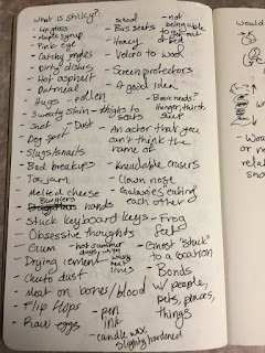
Anyway, for this year's film, I was thinking of doing a film with little vignettes/animations that all have to do with a theme. My theme is going to be sticky. I have a huge list of stuff that I could consider sticky, and I'll keep building on it to see what I think is the most solid.

Here's a picture of the growing list of things that could be considered sticky:


I also thought I'd set up a mood board here for look/style/etc.

Look:


I'd love to achieve the smoothness of Tako Faito, or at least the coloring style. I would really like to focus more on the animation since I'm doing more something like vignettes than anything else.

The transitions would be metamorphosis definitely, but the question is what kind of metamorphosis. There's the Black or White music video metamorphosis (skip to 5:26):
 

Where stuff recedes and adds as necessary, but the base is still there. Or the metamorphosis where the transition is something coming out of the previous object/thing:

Or it goes from identifiable shape to identifiable shape with splotches/other shapes in between:

I think I'm just going to have to assess what type I'll do based on production time and the look I'm going for. As for coloring, I also kinda wanna go with the styles seen above, the "lineless shapes unless they overlap" style.

Speaking of production time, I need to make a schedule/work log. So here it is for now, I'll be sure to change the page link for the log soon. Anyway, that's all for now. More to come soon.

0 comments: